
Course Upgrade Projects
These projects were built using Articulate Storyline. The full projects are proprietary; because of this I’ve included just a few examples of slides isolated from the full projects.
Gallery
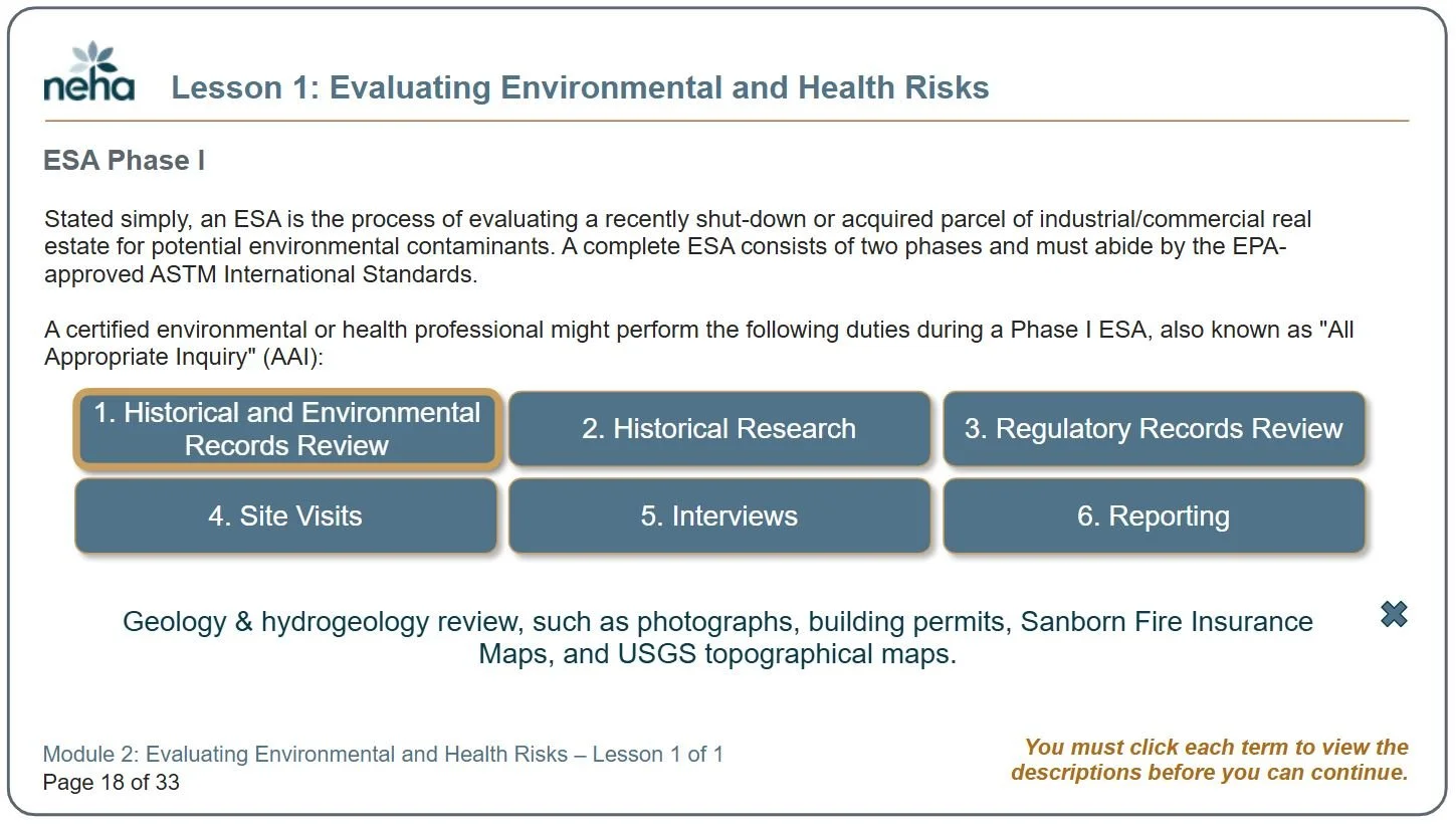
Top left: This slide illustrates an approach to some content that necessitated a number of definitions. Instead of listing them as a long text block, I made the definitions interactive. Participants click each term to see the definition appear below the buttons. I like this approach because it piques a participant’s curiosity more than a static list of terms.
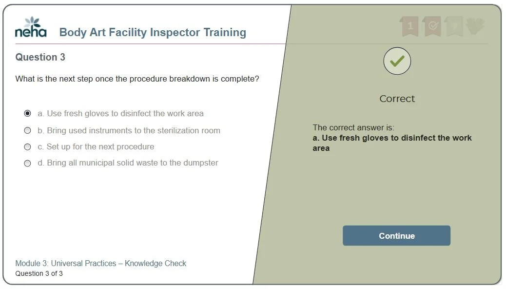
Top right: This slide illustrates one way we provide feedback for knowledge check questions. Here, you see a layer of feedback that confirms whether the participant’s response was correct, and provides elaboration on the answer.
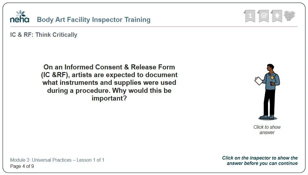
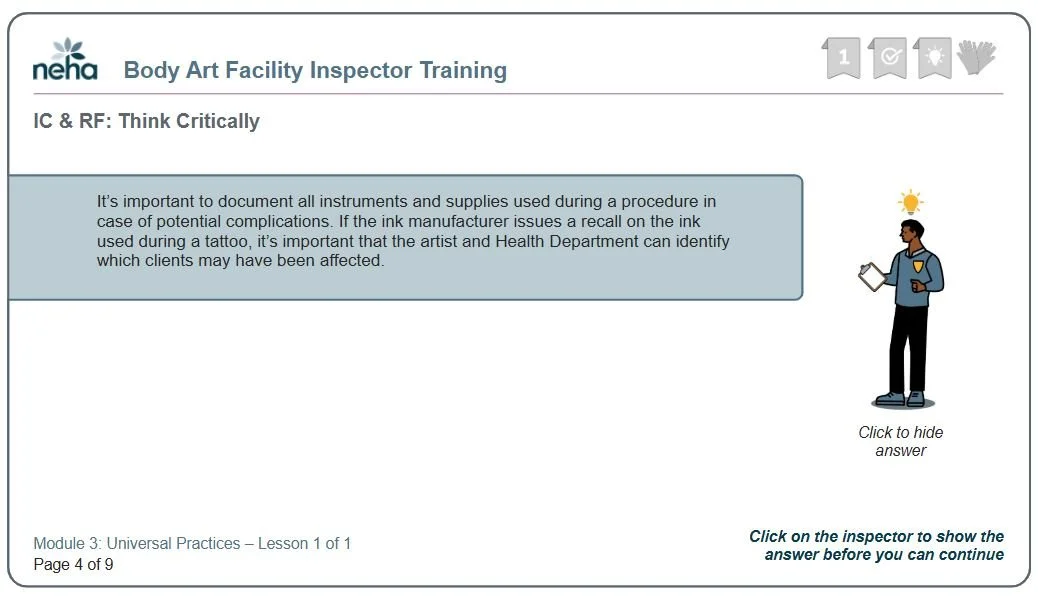
Bottom Left and Bottom Right: These two slides illustrate content posed as questions. These type of series sparks curiosity more so than writing out the information. The answer to this question appears when participants click the figure on the slide.
Before & After Gallery

After
For slides like this one (left), I focused on improving graphics to better convey content, as well as color and style branding. The new, revised slide appears on the right.
Sometimes courses simply need a modernization upgrade. This was the case for one of our client’s courses about cleaning up toxic waste sites. For this project, I worked from content presented in the original slides and used adult learning principles to clean up the presentation of the content. I also worked with a graphic designer to improve the graphics themselves. The original slides were built using Lectora (by a different instructional designer) and I took advantage of the opportunity to move the course into Articulate Storyline.
Before
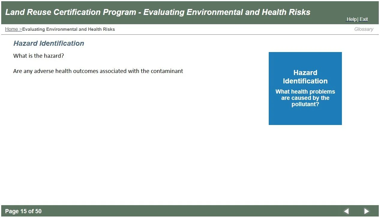
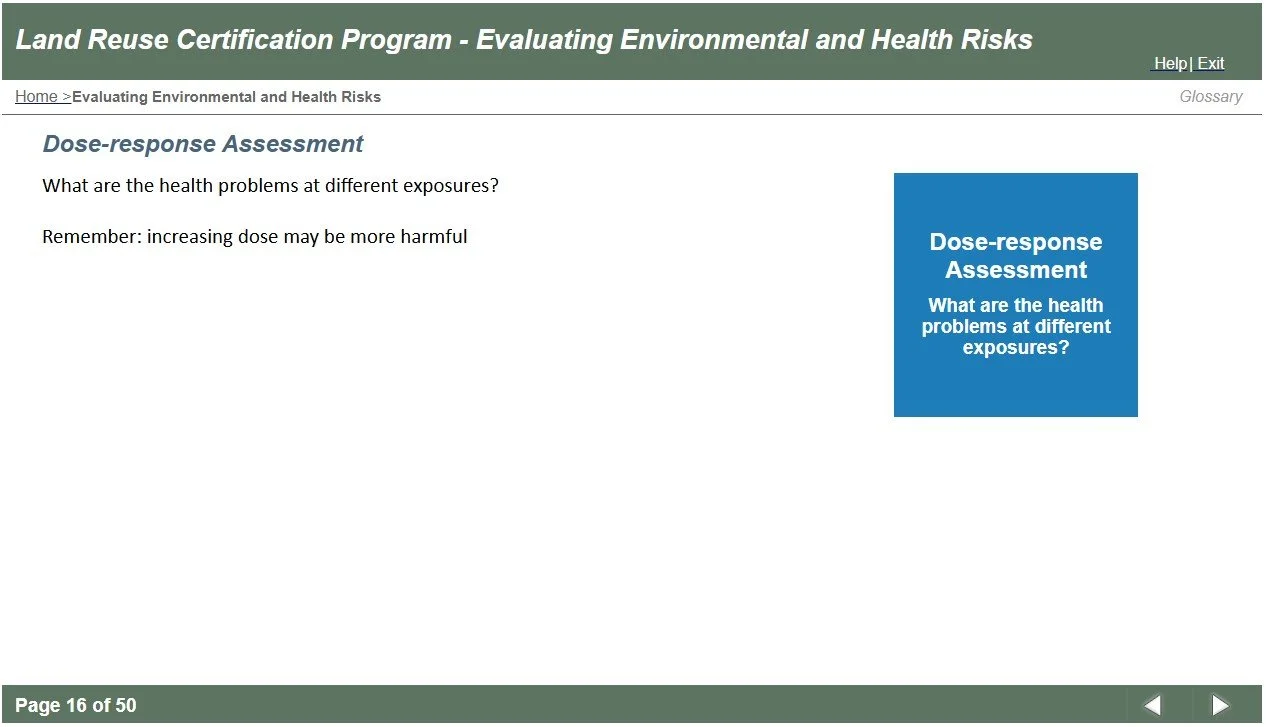
Before
After
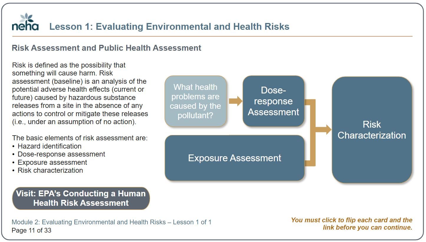
In the original course, there were a number of areas where concepts could be conveyed more appropriately by merging them into one slide. This provides a larger picture of the context, and how concepts relate to one another. In this example, we can see that the original instructional designer used multiple slides, each with a single definition on it, to explain the relationship across four terms (there were four slides altogether; I’ve included two of them here on the left). I redesigned this series of disjointed slides into one slide, and made use of flip cards to show the definition on the back side of each term. Compiling the terms all onto one slide provides the additional ability to illustrate the relationships across all the concepts, illustrating the bigger picture for learners.